BDC London
Designing captivating event spaces that inspire and engage


The challenge
In the rebranding initiative for Business Design Centre (BDC), the pivotal transformation centred around the BDC and its rich heritage. The goal was not just to modernise the visual identity but to create an inspiring foundation that would resonate across various branding collaterals and marketing assets. This case study outlines how the new visual identity effectively facilitated the development of cohesive and compelling branding materials.
Research & Strategy
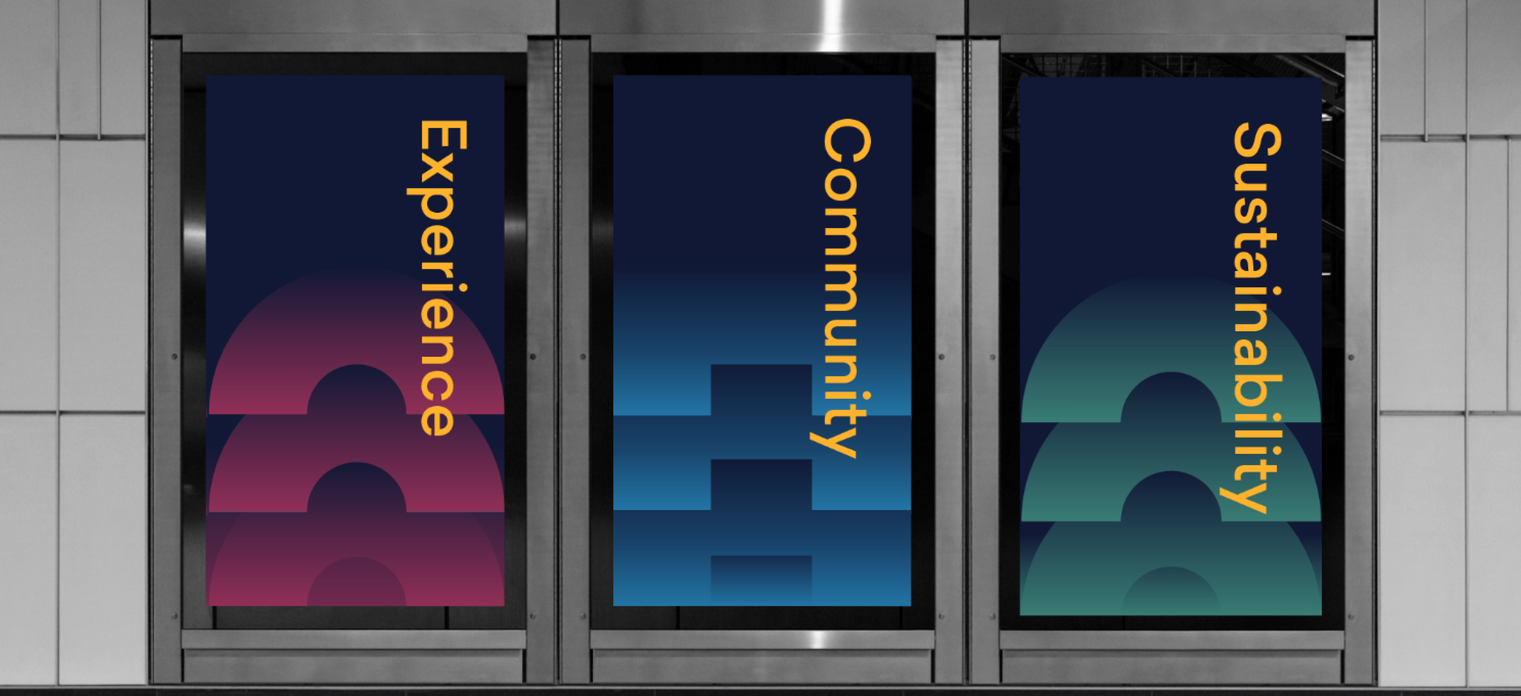
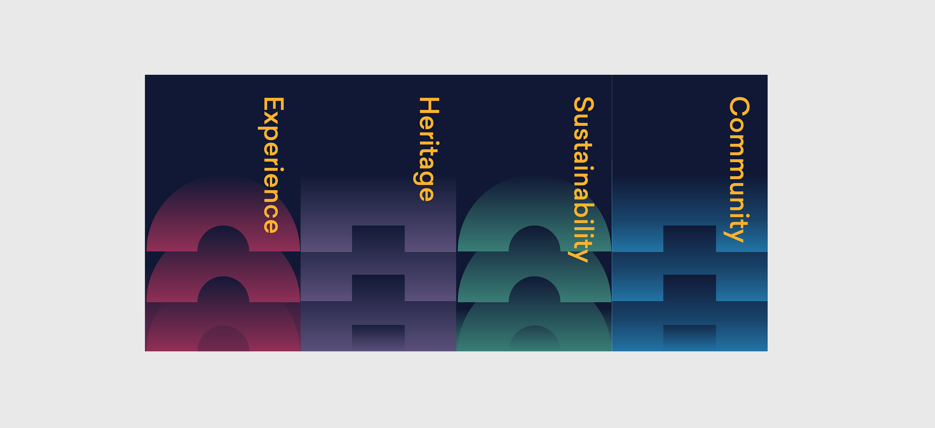
The new visual identity was rooted in a deep understanding of BDC's heritage, business goals, and personas established through interviews and workshops. By leveraging the four main pillars—Experience, Design & Heritage, Sustainability, and Community—we were able to create a framework that informed all design decisions. This structure ensured that each collateral piece not only represented the rebranded identity but also echoed the values that BDC stands for.
Visual Language
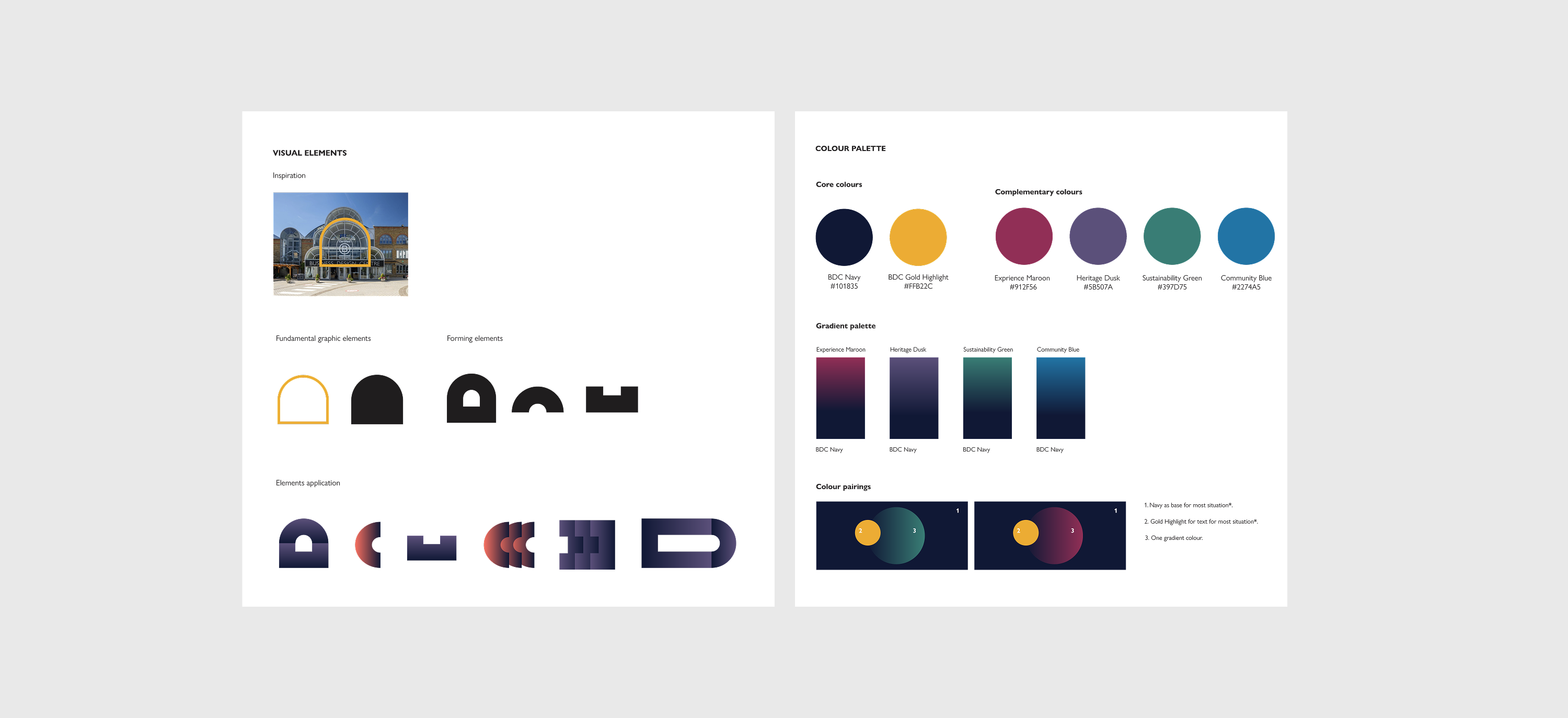
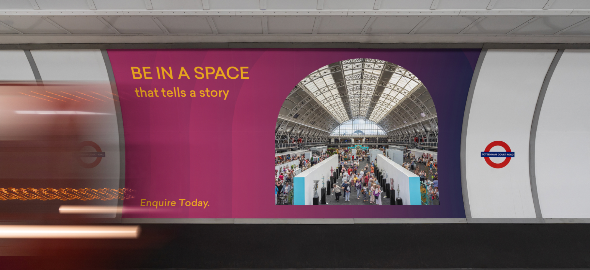
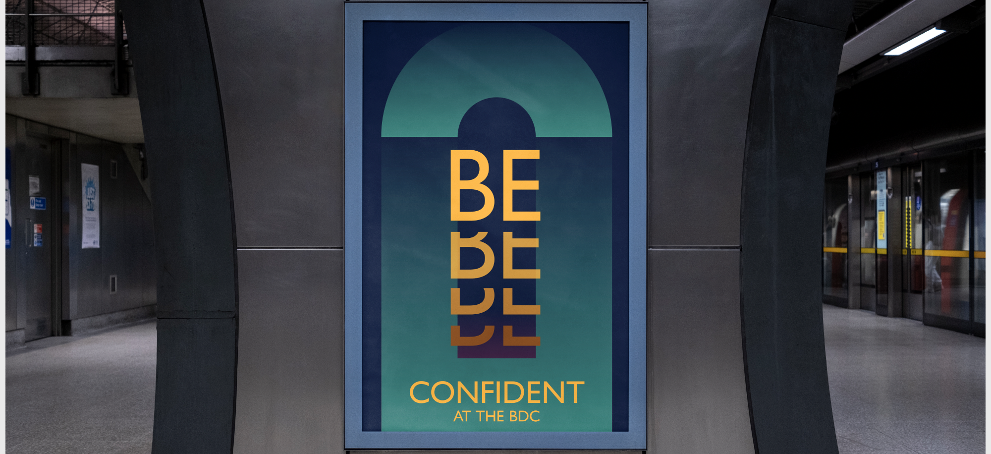
The arch of the roof, as a defining architectural element, became the cornerstone of our visual language. This iconic shape allowed for a recognisable and memorable motif that could be adapted across various design assets. For instance, the arch-inspired patterns were integrated into everything from digital media to printed brochures, providing a cohesive experience for the audience.
Colour Palette Reimagined
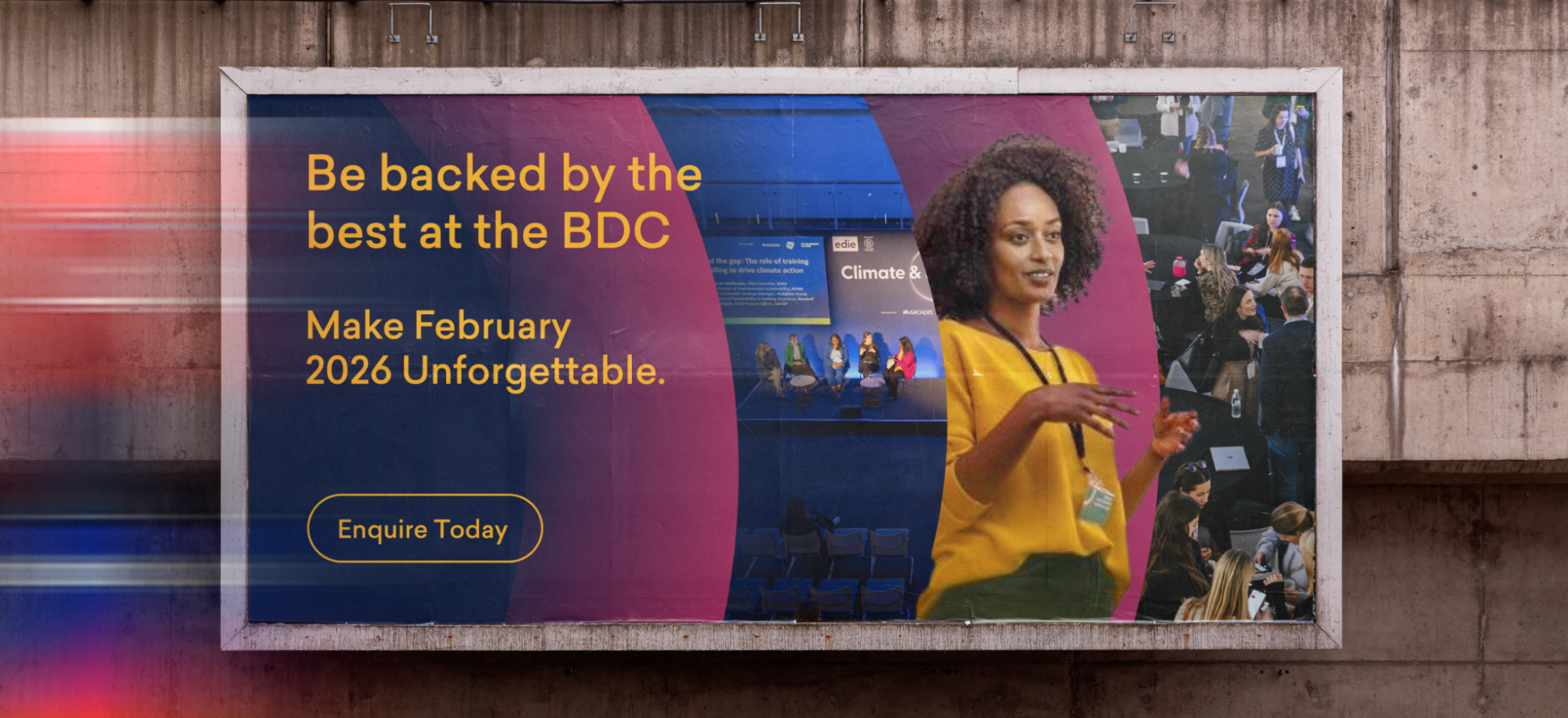
The refreshed colour palette was crucial in differentiating the new brand identity while still honouring its roots. By maintaining the navy and gold as core colours and introducing maroon, dusk, green, and blue, we enhanced visual communication. This strategic choice improved the effectiveness of marketing materials; for example, using maroon for calls to action in brochures created urgency, while green was utilised to highlight sustainability initiatives, reinforcing the pillar of Sustainability in our messaging.
Typography
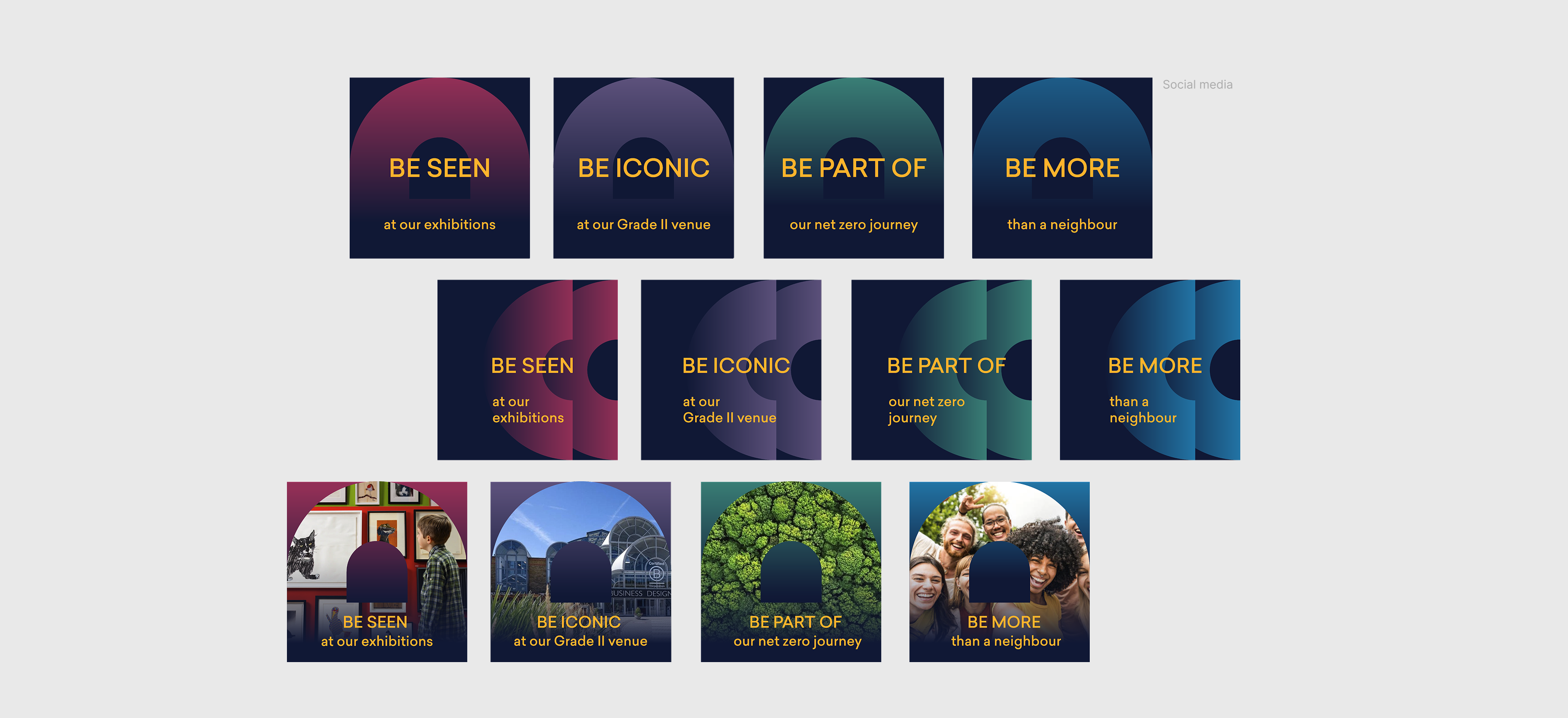
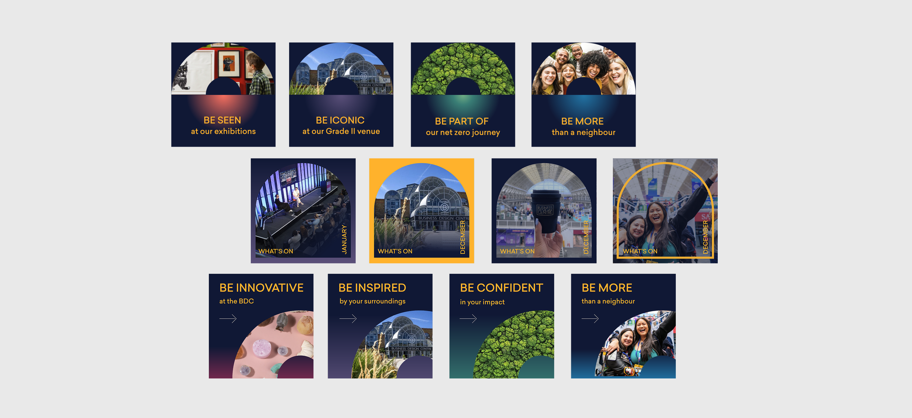
The typography is modern and accessible, with clean lines that allow for easy readability. The word "Be" is prominently featured in a larger font size, creating a focal point that draws attention to each pillar's accompanying message.
"Be" Campaign
The "Be" Campaign is designed around four key pillars that represent our commitment to fostering community engagement, sustainability, and inspiration. Each pillar embodies a distinct message that resonates with our audience, encouraging them to connect and participate in meaningful ways. The campaign utilises a bold and inviting color scheme that reflects the energy and diversity of our community. Each pillar is represented by a unique color that conveys its specific message while maintaining harmony within the overall brand identity. the "Be" Campaign not only communicates essential values and invites participation but also utilises a strong visual identity that enhances engagement and fosters a sense of community.
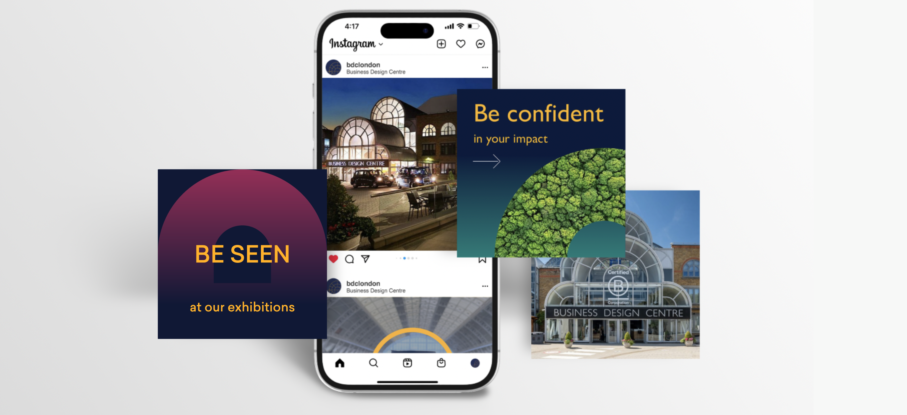
Application in Branding Collaterals
The new visual identity was integrated into various branding materials, including brochures that utilised a colour-coded system to highlight BDC's offerings clearly. The rebrand extended to digital platforms with a clean web design featuring the arch motif, improving user engagement through distinct colour contrasts. Social media graphics maintained consistency with the overall branding by incorporating vibrant colours and arch elements, using specific colour combinations to connect with targeted audiences and enhance brand recognition.
Resulting Impact
The impact of the new visual identity has been profound, providing BDC with a refreshed yet familiar look that attracts creative industries and elevates its market presence. The strategic design choices facilitated the development of collaterals that tell a story, connect with audiences, and achieve business goals. As a result, branding assets have not only garnered positive feedback but have also driven increased engagement and interest in BDC's offerings.
Conclusion
This case study illustrates how a thoughtfully developed visual identity serves as a powerful tool in creating effective branding collaterals and marketing design assets. By aligning the design with heritage and strategic goals, BDC can confidently move forward, showcasing its commitment to fostering community and innovation within the creative sector. The rebrand is not merely about aesthetic appeal; it is about crafting a compelling narrative that resonates with stakeholders and patrons alike.