Aerox Health
Transforming the identity of the future of life-saving innovation

Overview
Aerox Health is committed to revolutionising healthcare with innovative solutions that promote wellness and accessibility. As the company expanded its vision and offerings, a rebranding initiative was essential to communicate its values and goals more effectively. This case study details the comprehensive rebranding process undertaken to redesign the logo, develop a cohesive visual identity, and create marketing and digital assets, including an updated web presence.
The Challenge
The existing brand identity of Aerox Health lacked clarity and did not fully reflect its mission and innovative spirit. The goal was to create a contemporary brand that resonates with healthcare professionals and consumers alike, while also establishing a strong presence in a competitive market. The challenge was to integrate new technologies and messaging into a fresh visual identity without losing the essence of what Aerox Health represents.
Logo Redesign
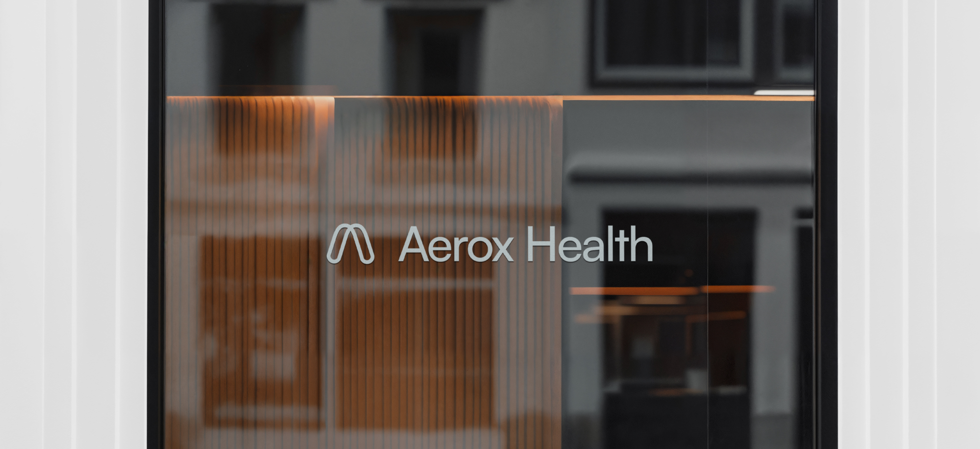
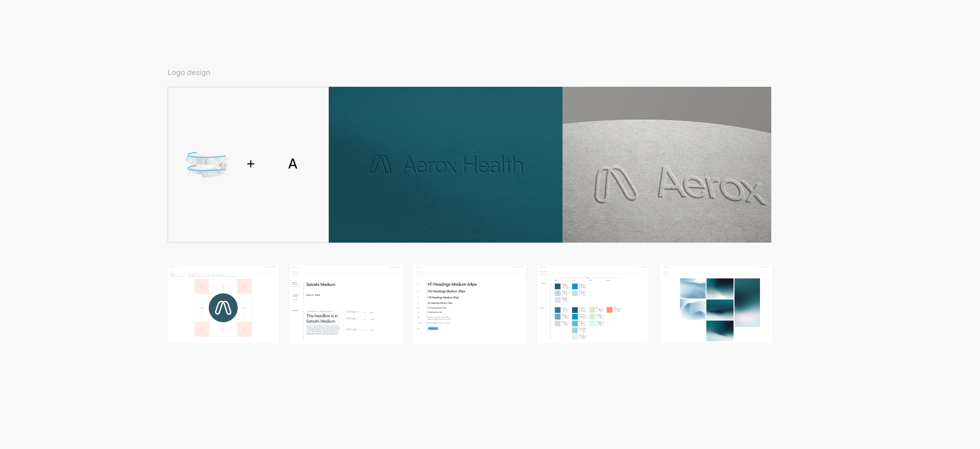
The logo redesign aimed to create a modern and approachable identity for Aerox Health. We adopted a clean, sans-serif font that conveys professionalism and accessibility. The emblem features a stylised "A" that incorporates organic shapes, symbolising the arch from the dental device, which is the core product of the business, highlighting health and growth. The design reflects movement and fluidity, echoing the company's commitment to dynamic health solutions. The new logo serves as a versatile centrepiece for both digital and print applications.
Visual Identity Design
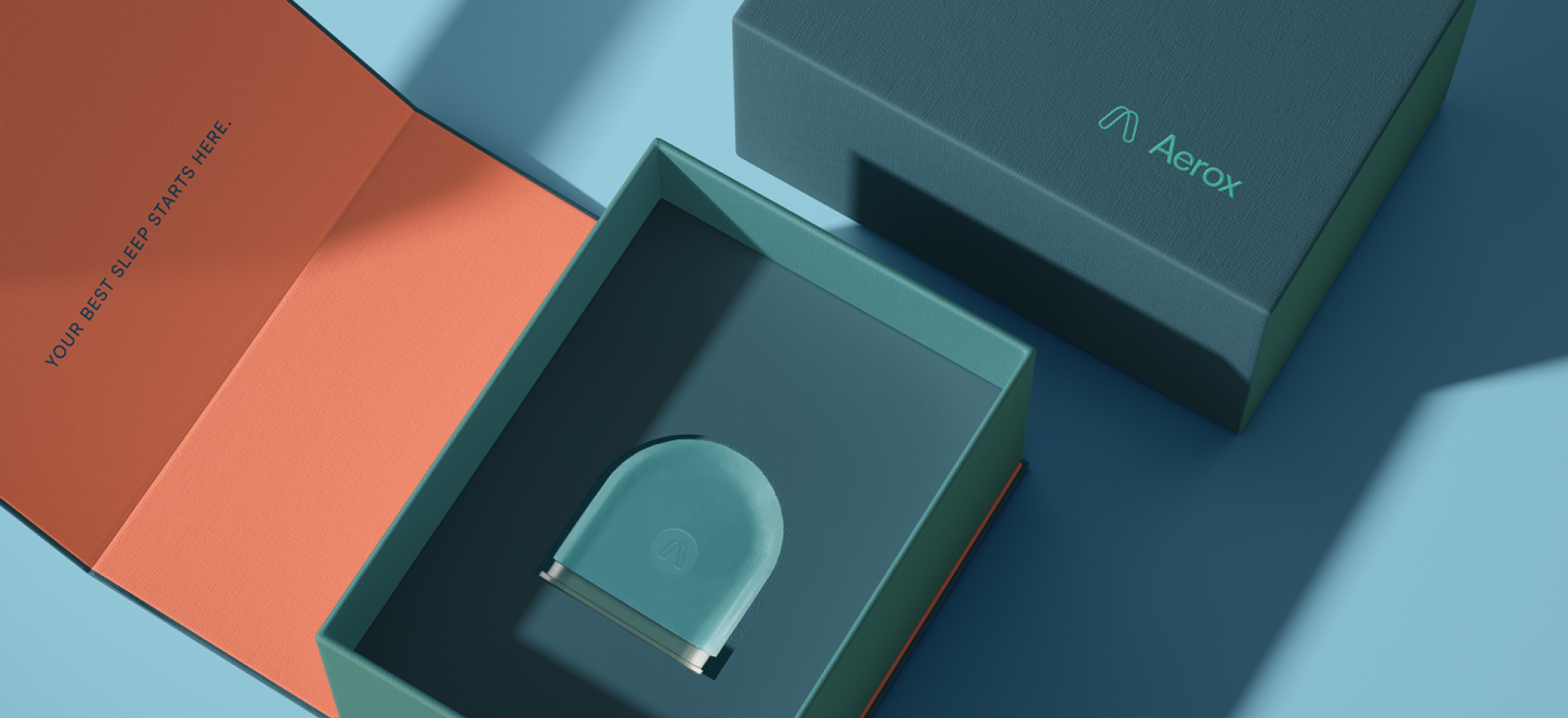
Building on the new logo, the visual identity now conveys a sense of clarity and trust. The colour palette was refreshed to include shades of blue, green, and white—colours associated with health and tranquillity. These hues visually represent Aerox Health's focus on holistic wellness. To complement the colour scheme, custom illustrations and icons were created to enhance visual storytelling across various platforms.
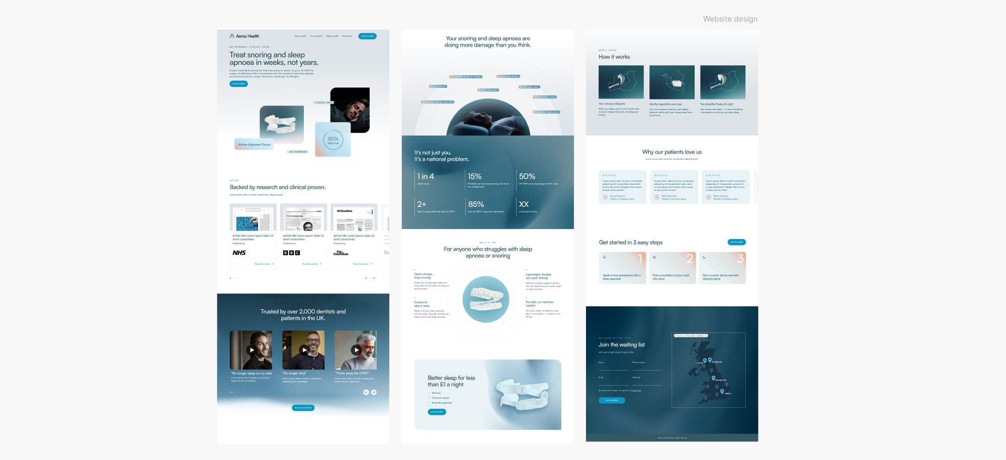
Web Design
The redesign of Aerox Health's website was pivotal in creating an engaging digital presence. The user experience (UX) was enhanced through intuitive navigation and a responsive layout. The homepage was designed to provide a welcoming introduction to Aerox Health, featuring visually compelling banners and clear calls to action that guide users toward services.
Conclusion
The rebranding of Aerox Health has successfully positioned the company as a leader in innovative health solutions. The new logo and visual identity effectively communicate the essence of the brand while appealing to a diverse audience. Through the integration of marketing and digital assets, Aerox Health now has a strong, cohesive identity that enhances its engagement with healthcare professionals and consumers alike. This transformation not only strengthens Aerox Health's market presence but also supports its mission to promote wellness and accessibility in healthcare.